05 - Compose Basics
Recap
In 03 - Android Layout and 04 - Android Resources you built screens the classical way. An XML layout is inflated by an Activity, views are found by id, and Kotlin code mutates them. HW1 (Tic-Tac-Toe in XML) is built exactly like that. From this lecture on, the Android part of the course uses Jetpack Compose: the UI is written in Kotlin as functions of state. Everything else you learned (activities, intents, services, broadcasts, resources) stays relevant. Compose replaces only the view layer.
By the end of this lecture you should be able to:
- Explain the difference between imperative (XML + views) and declarative (Compose) UI.
- Create a Compose project with AGP 9, the Compose BOM and the course version catalog.
- Write and preview composable functions.
- Arrange UI with
Column,Row,Box, arrangements, alignments and modifiers, and explain why modifier order matters. - Use the basic components (
Text,Image,Icon, buttons, text fields), string resources, and lazy lists and grids. - Build a screen skeleton with
Scaffoldand handle edge-to-edge window insets.
Lecture demos: native-2026-fall
Road map: from Tic-Tac-Toe to SportMap
The Android lectures build towards two deliverables. HW2 is Tic-Tac-Toe again, this time in Compose. The final project is SportMap, a GPS training and orienteering helper. Its features are a map with your track, checkpoints (CP) and waypoints (WP), live statistics, background tracking with a lock-screen notification, a compass, a session history, GPX export, and sync to the sportmap backend.
| Lecture | Topic | Used for |
|---|---|---|
| 05 | Compose basics | HW2 board, every screen |
| 06 | State and side effects | HW2 game state, rotation |
| 07 | Material 3, theming, adaptive layouts | dark mode, landscape layout, dialogs |
| 08 | Coroutines | everything asynchronous |
| 09 | Flow | live location, sensor and database streams |
| 10 | Architecture, ViewModel, Hilt, DataStore | HW2 stats, app skeleton, settings |
| 11 | Navigation 3 | stats screen, sessions list and detail |
| 12 | Permissions | location and notifications |
| 13 | Location | live position, distances, pace |
| 14 | Notifications | lock-screen controls |
| 15 | Foreground service | tracking in the background |
| 16 | Google Maps | map, track, CP/WP markers |
| 17 | Sensors | on-screen compass |
| 18 | Room database and files | session history, GPX export |
| 19 | Networking and sync | account, backend sync, offline sync |
Imperative vs declarative
With views you describe the UI once in XML and then change it step by step:
<!-- res/layout/activity_main.xml -->
<TextView
    android:id="@+id/textViewStatus"
    android:layout_width="wrap_content"
    android:layout_height="wrap_content"
    android:text="X to move" />
// MainActivity.kt - every change is an explicit command
val textViewStatus = findViewById<TextView>(R.id.textViewStatus)
textViewStatus.text = "O to move"
With Compose you describe what the UI looks like for a given state. When the state changes, Compose calls your function again and updates only what is different:
@Composable
fun Status(nextPlayer: String) {
    Text(text = "$nextPlayer to move")
}
There is no findViewById, no view object you keep around and no "set text" call. Your job is to model the state correctly (lecture 06). Compose's job is to make the screen match it. This is often written as UI = f(state).
Why Google moved to Compose:
- Less code. A layout, its adapter and its binding code collapse into one Kotlin function.
- One language. Logic, layout and styling all live in Kotlin, with full IDE support.
- No out-of-sync bugs. The UI is derived from state, so you can't forget to update a view.
- Built-in support for animations, theming, previews, adaptive layouts and testing.
- Interop. Compose can live inside XML screens, and views can live inside Compose.
Project setup
In Android Studio: New Project → Empty Activity. That template is the Compose one; "Empty Views Activity" is the XML one you used for HW1. Use API 30 as the minimum SDK.
What AGP 9 changed
Android Gradle Plugin 9 has built-in Kotlin support. Older projects (and most tutorials and AI-generated build files) apply the org.jetbrains.kotlin.android plugin. With AGP 9 you don't, and adding it is an error. The Compose compiler ships as a Kotlin compiler plugin, org.jetbrains.kotlin.plugin.compose, and its version is always the Kotlin version. Applying it at a newer version also upgrades the Kotlin that AGP uses (AGP 9.4 defaults to Kotlin 2.2.10).
kapt is not supported with built-in Kotlin. Annotation processors (Hilt, Room) run on KSP. There is no kotlinOptions { jvmTarget = ... } either: the Kotlin JVM target follows compileOptions.targetCompatibility.
Gradle files
The wizard generates a version catalog in gradle/libs.versions.toml, a top-level build.gradle.kts and app/build.gradle.kts. After creating the project, bump the Kotlin and BOM versions to the ones below. The wizard's defaults lag behind.
# gradle/libs.versions.toml (Compose part)
[versions]
agp = "9.4.1"
kotlin = "2.4.20"
coreKtx = "1.19.1"
lifecycle = "2.11.0"
activityCompose = "1.13.0"
composeBom = "2026.09.00"

[libraries]
androidx-core-ktx = { group = "androidx.core", name = "core-ktx", version.ref = "coreKtx" }
androidx-activity-compose = { group = "androidx.activity", name = "activity-compose", version.ref = "activityCompose" }
androidx-lifecycle-runtime-compose = { group = "androidx.lifecycle", name = "lifecycle-runtime-compose", version.ref = "lifecycle" }
androidx-compose-bom = { group = "androidx.compose", name = "compose-bom", version.ref = "composeBom" }
androidx-compose-ui = { group = "androidx.compose.ui", name = "ui" }
androidx-compose-ui-graphics = { group = "androidx.compose.ui", name = "ui-graphics" }
androidx-compose-ui-tooling = { group = "androidx.compose.ui", name = "ui-tooling" }
androidx-compose-ui-tooling-preview = { group = "androidx.compose.ui", name = "ui-tooling-preview" }
androidx-compose-material3 = { group = "androidx.compose.material3", name = "material3" }
androidx-compose-material-icons-core = { group = "androidx.compose.material", name = "material-icons-core" }

[plugins]
android-application = { id = "com.android.application", version.ref = "agp" }
kotlin-compose = { id = "org.jetbrains.kotlin.plugin.compose", version.ref = "kotlin" }
// build.gradle.kts (top level)
plugins {
    alias(libs.plugins.android.application) apply false
    alias(libs.plugins.kotlin.compose) apply false
}
// app/build.gradle.kts
plugins {
    alias(libs.plugins.android.application)
    alias(libs.plugins.kotlin.compose)
}

android {
    namespace = "ee.taltech.sportmap"
    compileSdk {
        version = release(37)
    }

    defaultConfig {
        applicationId = "ee.taltech.sportmap"
        minSdk = 30
        targetSdk = 37
        versionCode = 1
        versionName = "1.0"
    }

    compileOptions {
        // The wizard generates VERSION_11 - use 17: maps-compose and other libraries ship JVM 17 bytecode
        sourceCompatibility = JavaVersion.VERSION_17
        targetCompatibility = JavaVersion.VERSION_17
    }
    buildFeatures {
        compose = true
    }
}

dependencies {
    implementation(libs.androidx.core.ktx)
    implementation(libs.androidx.activity.compose)
    implementation(libs.androidx.lifecycle.runtime.compose)

    // The BOM pins compatible versions of all Compose libraries - no versions below
    implementation(platform(libs.androidx.compose.bom))
    implementation(libs.androidx.compose.ui)
    implementation(libs.androidx.compose.ui.graphics)
    implementation(libs.androidx.compose.ui.tooling.preview)
    implementation(libs.androidx.compose.material3)
    implementation(libs.androidx.compose.material.icons.core)
    debugImplementation(libs.androidx.compose.ui.tooling)
}
The Compose BOM (bill of materials) is a version list. You import it once with platform(...) and declare the Compose libraries without versions, and the BOM picks a set that is tested together. Libraries outside the BOM (activity, lifecycle, navigation, Room...) keep their own versions in the catalog.
Course version catalog - all versions used in lectures 05-19
Later lectures add [libraries] and [plugins] entries as they need them. These are the versions they use (checked October 2026):
[versions]
agp = "9.4.1"
kotlin = "2.4.20"
ksp = "2.3.12"
coreKtx = "1.19.1"
lifecycle = "2.11.0"
activityCompose = "1.13.0"
composeBom = "2026.09.00"
navigation3 = "1.2.0"
hilt = "2.60.1"
androidxHilt = "1.4.0"
room3 = "3.0.3"
datastore = "1.2.1"
work = "2.12.0"
ktor = "3.6.0"
kotlinxSerialization = "1.11.0"
coroutines = "1.11.0"
playServicesLocation = "21.4.0"
mapsCompose = "9.0.0"
secrets = "2.0.1"
Android Studio highlights outdated catalog entries. Update them, but update together: the Compose compiler plugin, KSP and Kotlin must agree. When a tutorial (or an AI assistant) gives you kotlinOptions { }, kapt(...) or id("org.jetbrains.kotlin.android"), it was written for AGP 8 or older. Translate it instead of pasting it.
The activity
class MainActivity : ComponentActivity() {
    override fun onCreate(savedInstanceState: Bundle?) {
        super.onCreate(savedInstanceState)
        enableEdgeToEdge()
        setContent {
            SportMapTheme {
                // composables go here
            }
        }
    }
}
ComponentActivityreplacesAppCompatActivity. Compose needs no AppCompat.setContent { }replacessetContentView(R.layout...). Its lambda is the root of your composition.SportMapThemeis generated by the wizard inui/theme/(lecture 07).enableEdgeToEdge()lets the app draw behind the status and navigation bars (see Scaffold and window insets).
The activity still has its usual lifecycle from lecture 02. A rotation still recreates it, and lecture 06 explains what that means for your state.
Composable functions
@Composable
fun Greeting(name: String, modifier: Modifier = Modifier) {
    Text(
        text = "Hello $name!",
        modifier = modifier
    )
}
A composable function:
- is annotated with
@Composableand can only be called from another composable; - emits UI instead of returning it, so its return type is
Unit; - is named in PascalCase, like a class, because it describes a UI element;
- takes the data it shows as parameters, and by convention its first optional parameter is
modifier: Modifier = Modifier, which it passes to its root element.
Compose may call a composable often, in any order and possibly in parallel. Calls are skipped when inputs didn't change. So composables must be:
- fast: no I/O, no heavy computation in the body;
- side-effect free: don't write files, change global variables or start network calls while composing (lecture 06 shows the proper tools for side effects);
- idempotent: the same inputs must produce the same UI.
Previews
Android Studio renders composables without running the app:
@Preview(showBackground = true)
@Composable
private fun GreetingPreview() {
    SportMapTheme {
        Greeting("Android")
    }
}
Useful variants:
@Preview(name = "Phone landscape", device = "spec:width=891dp,height=411dp")
@Preview(name = "Dark", uiMode = Configuration.UI_MODE_NIGHT_YES, showBackground = true)
@PreviewLightDark       // light + dark in one annotation
@PreviewScreenSizes     // phone, foldable, tablet, desktop
@Preview(fontScale = 2f) // large-font users
A preview function takes no parameters (or uses @PreviewParameter), so preview stateless composables with sample data. Interactive mode lets you click inside the preview, and Run preview deploys only that composable to a device.
Arranging elements: Column, Row, Box
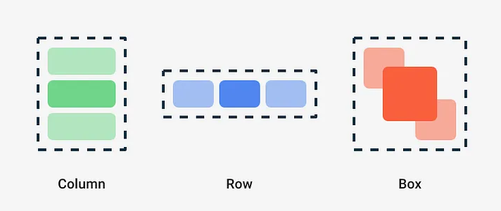
@Composable
fun PlayerInfo(name: String, wins: Int) {
    Column {                        // vertical, like LinearLayout vertical
        Text(name)
        Text("Wins: $wins")
    }
}

@Composable
fun ScoreLine() {
    Row {                           // horizontal
        Text("X")
        Text(" 3 : 2 ")
        Text("O")
    }
}

@Composable
fun CellWithBadge() {
    Box {                           // stacked on top of each other, like FrameLayout
        Text("X", fontSize = 48.sp)
        Text("!", modifier = Modifier.align(Alignment.TopEnd))
    }
}
Positioning children:
| Container | Main axis | Cross axis |
|---|---|---|
Column | verticalArrangement = Arrangement.Top / Center / Bottom / SpaceBetween / SpaceEvenly / spacedBy(8.dp) | horizontalAlignment = Alignment.Start / CenterHorizontally / End |
Row | horizontalArrangement = Arrangement.Start / Center / End / SpaceBetween / spacedBy(8.dp) | verticalAlignment = Alignment.Top / CenterVertically / Bottom |
Box | - | contentAlignment = Alignment.Center for all children, Modifier.align(...) per child |
Modifier.weight(1f) is the Compose version of layout_weight. It exists only inside Row and Column scopes, and it distributes the remaining space:
@Composable
fun StatsBar() {
    Row(
        modifier = Modifier.fillMaxWidth(),
        horizontalArrangement = Arrangement.spacedBy(8.dp)
    ) {
        Text("Overall", modifier = Modifier.weight(1f))
        Text("Checkpoint", modifier = Modifier.weight(1f))
        Text("Waypoint", modifier = Modifier.weight(1f))
    }
}
Spacer(Modifier.height(16.dp)) adds fixed space, and Spacer(Modifier.weight(1f)) pushes the following items to the end.
Nested Row/Column is not a performance problem in Compose. Compose measures every child once, unlike nested LinearLayouts with weights, which measured multiple times. So most screens don't need constraints. androidx.constraintlayout:constraintlayout-compose exists for complex relative layouts, and BoxWithConstraints (lecture 07) is something different: it gives you the available size.
Modifiers
A Modifier is an ordered chain of decorations: size, padding, background, click handling, semantics and more. Every built-in composable accepts one.
@Composable
fun Cell(symbol: String, onClick: () -> Unit, modifier: Modifier = Modifier) {
    Box(
        modifier = modifier
            .size(96.dp)
            .clip(RoundedCornerShape(8.dp))
            .background(MaterialTheme.colorScheme.surfaceVariant)
            .clickable(onClick = onClick)
            .padding(8.dp),
        contentAlignment = Alignment.Center
    ) {
        Text(symbol, style = MaterialTheme.typography.displayMedium)
    }
}
Order matters. Each modifier wraps everything after it:
// Blue area includes the padding - padding is inside the background
Modifier.background(Color.Blue).padding(16.dp)

// Padding is outside - a transparent 16dp margin around a blue box
Modifier.padding(16.dp).background(Color.Blue)

// Whole 96dp area is clickable
Modifier.clickable { }.padding(16.dp)

// Only the inner area (minus padding) reacts to clicks
Modifier.padding(16.dp).clickable { }
There is no margin in Compose. Padding before a background is the margin.
Frequently used modifiers:
| Group | Modifiers |
|---|---|
| Size | size, width, height, fillMaxSize, fillMaxWidth(0.5f), wrapContentSize, aspectRatio(1f), requiredSize, weight (Row/Column) |
| Position | padding, offset, align (Box/Row/Column scope) |
| Drawing | background, border, clip, alpha, shadow, rotate, graphicsLayer |
| Interaction | clickable, toggleable, selectable, draggable, verticalScroll, pointerInput |
| Semantics | semantics, clearAndSetSemantics, testTag |
Pass your modifier parameter to the root element of your composable and let the caller decide size and position. Inside, start a new chain with Modifier.
Basic components
Text and string resources
Text(
    text = stringResource(R.string.next_player, "X"),   // <string name="next_player">%1$s to move</string>
    style = MaterialTheme.typography.titleLarge,
    maxLines = 1,
    overflow = TextOverflow.Ellipsis
)

Text(pluralStringResource(R.plurals.games_played, count, count))
All the resources from lecture 04 still work: strings, plurals, dimensions, colors and drawables. stringResource, pluralStringResource, dimensionResource, colorResource and painterResource read them in a composable. Keep user-visible text in strings.xml. Hard-coded strings in these lectures are for brevity.
Image and Icon
Image(
    painter = painterResource(R.drawable.board_background),
    contentDescription = null,                  // decorative
    contentScale = ContentScale.Crop,
    modifier = Modifier.fillMaxSize()
)

Icon(
    imageVector = Icons.Default.Refresh,
    contentDescription = stringResource(R.string.new_game)
)
Icons.Default.* comes from material-icons-core (a small set: Add, Close, Refresh, Settings, LocationOn...). Material 3 1.4 no longer pulls it in for you, hence the explicit dependency above. For anything else, add icons as vector drawables: New → Vector Asset → Clip art has the full Material Symbols set. Then use painterResource(R.drawable.ic_compass). The big material-icons-extended artifact is frozen and huge, so avoid it.
Buttons
Button(onClick = { /* primary action */ }) { Text("Start") }
FilledTonalButton(onClick = { }) { Text("Add CP") }
OutlinedButton(onClick = { }) { Text("Add WP") }
TextButton(onClick = { }) { Text("Cancel") }
IconButton(onClick = { }) {
    Icon(Icons.Default.Settings, contentDescription = "Settings")
}
A button's content is a composable lambda. Put a Row of icon and text inside if you need both.
Text fields
var email by remember { mutableStateOf("") }   // state - explained in lecture 06

OutlinedTextField(
    value = email,
    onValueChange = { email = it },
    label = { Text("Email") },
    singleLine = true,
    keyboardOptions = KeyboardOptions(
        keyboardType = KeyboardType.Email,
        imeAction = ImeAction.Next
    )
)

var password by remember { mutableStateOf("") }
OutlinedTextField(
    value = password,
    onValueChange = { password = it },
    label = { Text("Password") },
    visualTransformation = PasswordVisualTransformation(),
    keyboardOptions = KeyboardOptions(keyboardType = KeyboardType.Password)
)
A text field does not remember what you typed. It shows value and reports edits through onValueChange, and you store the new value. That's the same "state down, events up" pattern you'll use everywhere (lecture 06). Newer overloads take a TextFieldState (rememberTextFieldState()) instead of the value/callback pair. Both are fine.
Lists and grids
A Column composes all its children, even ones that are off-screen. For long or unbounded lists use lazy layouts. They compose only the visible items, like RecyclerView, but without adapters or view holders.
data class GameResult(val id: Long, val winner: String, val durationSec: Int)

@Composable
fun GameHistory(results: List<GameResult>, modifier: Modifier = Modifier) {
    LazyColumn(
        modifier = modifier.fillMaxSize(),
        contentPadding = PaddingValues(16.dp),
        verticalArrangement = Arrangement.spacedBy(8.dp)
    ) {
        item { Text("History", style = MaterialTheme.typography.headlineSmall) }
        items(results, key = { it.id }) { result ->
            Text("${result.winner} won in ${result.durationSec}s")
        }
    }
}
item { }adds one element, anditems(list) { }adds one per element.- Always give a stable
keyfor data that can change (insert, delete, reorder). It keeps item state and animations attached to the right row. LazyRowscrolls horizontally.LazyVerticalGrid(columns = GridCells.Fixed(3))orGridCells.Adaptive(minSize = 120.dp)makes grids.- Short content that only needs to scroll uses
Column(Modifier.verticalScroll(rememberScrollState())).
Don't put a LazyColumn inside a vertically scrolling Column: Compose throws, because the inner list would have infinite height. Use one LazyColumn with item { } blocks for the header parts.
Example: a square game board
HW2 asks for a board that is always square and uses the available space. The trick is aspectRatio(1f) plus weights:
@Composable
fun Board(
    cells: List<List<String>>,              // e.g. 3 x 3 of "", "X", "O"
    onCellClick: (row: Int, col: Int) -> Unit,
    modifier: Modifier = Modifier
) {
    Column(
        modifier = modifier
            .aspectRatio(1f)                // square, as big as the parent allows
            .background(MaterialTheme.colorScheme.outline),
        verticalArrangement = Arrangement.spacedBy(2.dp)   // grid lines = gaps
    ) {
        cells.forEachIndexed { row, rowCells ->
            Row(
                modifier = Modifier.weight(1f),
                horizontalArrangement = Arrangement.spacedBy(2.dp)
            ) {
                rowCells.forEachIndexed { col, symbol ->
                    Box(
                        modifier = Modifier
                            .weight(1f)
                            .fillMaxHeight()
                            .background(MaterialTheme.colorScheme.surface)
                            .clickable { onCellClick(row, col) },
                        contentAlignment = Alignment.Center
                    ) {
                        Text(symbol, style = MaterialTheme.typography.displayLarge)
                    }
                }
            }
        }
    }
}
The grid lines are the parent's background showing through 2dp gaps, so there's no extra outer border. Hide the outer edge with padding on the parent if your design needs that. The board takes its data and reports clicks. It doesn't decide who moves next. Lecture 06 adds the state.
Scaffold and window insets
Scaffold is the Material screen skeleton, with slots for a top bar, a bottom bar, a FAB and a snackbar host:
@OptIn(ExperimentalMaterial3Api::class)
@Composable
fun GameScreen() {
    Scaffold(
        topBar = { TopAppBar(title = { Text("Tic-Tac-Toe") }) },
        floatingActionButton = {
            FloatingActionButton(onClick = { /* new game */ }) {
                Icon(Icons.Default.Refresh, contentDescription = "New game")
            }
        }
    ) { innerPadding ->
        Board(
            cells = List(3) { List(3) { "" } },
            onCellClick = { _, _ -> },
            modifier = Modifier
                .padding(innerPadding)
                .padding(16.dp)
        )
    }
}
Apps that target API 35 or newer are edge-to-edge on Android 15+. The window extends behind the status bar, the navigation bar and the display cutout. Scaffold computes how much of the screen is covered by its bars and the system bars and hands you innerPadding. Apply it, or your content will hide under the system bars.
Without Scaffold, use inset modifiers directly:
Box(Modifier.fillMaxSize().safeDrawingPadding()) { /* ... */ }   // avoid bars, cutouts, keyboard
Column(Modifier.systemBarsPadding()) { /* ... */ }               // only status + navigation bar
Column(Modifier.imePadding()) { /* form moves above the keyboard */ }
A map is the typical exception. It should draw behind the bars, and only its controls need insets (lecture 16).
Views inside Compose and Compose inside views
Interop works both ways, so migration can be gradual:
// A classical View inside a composable
AndroidView(
    factory = { context -> TextClock(context) },
    update = { clock -> clock.format24Hour = "HH:mm:ss" }
)
<!-- A composable inside an XML layout -->
<androidx.compose.ui.platform.ComposeView
    android:id="@+id/composeView"
    android:layout_width="match_parent"
    android:layout_height="wrap_content" />
findViewById<ComposeView>(R.id.composeView).setContent { Greeting("from XML") }
In this course you'll meet one place where views remain mandatory: custom notification layouts are RemoteViews built from XML (lecture 14). Your XML knowledge from HW1 is still needed.
Accessibility basics
- Give every meaningful
Image/IconacontentDescription. Usenullfor decorative ones. - Use
spfor text so system font scaling works, and check with@Preview(fontScale = 2f). - Touch targets should be at least 48dp. Material components do this automatically. For custom clickables use
Modifier.minimumInteractiveComponentSize(). - Merge related texts so TalkBack reads them once:
Modifier.semantics(mergeDescendants = true) { }. - Turn on TalkBack on a real device once. You'll immediately hear what's missing.
XML → Compose cheat sheet
| XML / View | Compose |
|---|---|
TextView | Text |
EditText | TextField, OutlinedTextField |
ImageView | Image, Icon |
Button, ImageButton | Button, IconButton |
LinearLayout vertical / horizontal | Column / Row |
FrameLayout | Box |
layout_weight | Modifier.weight |
margin / padding | Modifier.padding (order decides) |
RecyclerView + adapter | LazyColumn, LazyRow, LazyVerticalGrid |
ScrollView | Modifier.verticalScroll |
CardView | Card |
Toolbar / ActionBar | TopAppBar in Scaffold |
include layout | call another composable |
visibility = GONE | if (visible) { ... } - just don't emit it |
styles.xml | MaterialTheme + parameters (lecture 07) |
layout-land/ | if (isLandscape) ... else ... (lecture 07) |
In the final project
The SportMap main screen is a map with a toolbar on top and three statistics sections below it. As a composable skeleton:
@Composable
fun StatsSection(
    title: String,
    distance: String,
    secondLine: String,          // duration for Overall, direct distance for CP and WP
    pace: String,
    modifier: Modifier = Modifier
) {
    Column(modifier = modifier, horizontalAlignment = Alignment.CenterHorizontally) {
        Text(title, style = MaterialTheme.typography.labelMedium)
        Text(distance, style = MaterialTheme.typography.titleMedium)
        Text(secondLine)
        Text(pace)
    }
}

@Composable
fun MapScreenLayout(modifier: Modifier = Modifier) {
    Column(modifier = modifier.fillMaxSize()) {
        Box(Modifier.weight(1f).fillMaxWidth()) {
            Text("Map comes here (lecture 16)", Modifier.align(Alignment.Center))
        }
        Row(Modifier.fillMaxWidth().padding(8.dp)) {
            StatsSection("Overall", "15 000 m", "1:35:47", "6:23", Modifier.weight(1f))
            StatsSection("CP", "1500 m", "1137 m", "6:37", Modifier.weight(1f))
            StatsSection("WP", "783 m", "332 m", "7:35", Modifier.weight(1f))
        }
    }
}
The map takes weight(1f), which is everything the stats row doesn't need. Lecture 07 moves the stats to the side in landscape.
Self preparation QA
- What does "declarative UI" mean in Compose? — You describe the UI for the current state, and when state changes Compose re-runs the affected composables and updates the screen. You never mutate a view directly.
- Which Gradle plugins does a Compose app need with AGP 9, and which one must you not add? —
com.android.applicationandorg.jetbrains.kotlin.plugin.compose(same version as Kotlin). Don't addorg.jetbrains.kotlin.android, because AGP 9 has built-in Kotlin. - What problem does the Compose BOM solve? — It pins a tested set of versions for all Compose libraries, so you declare them without versions and they never mismatch.
- Why must a composable be fast and free of side effects? — Compose can call it many times, skip it, or call it in a different order. I/O or state changes in the body would run unpredictably and slow every frame.
- What is the difference between
Modifier.padding(16.dp).background(Color.Red)andModifier.background(Color.Red).padding(16.dp)? — Modifiers apply in order. The first leaves a transparent 16dp margin around a red box, and the second paints the padding red as well. - When do you use
LazyColumninstead ofColumn, and why should items have keys? — For long or dynamic lists, because only visible items are composed. Keys keep item state and animations tied to the right data when the list changes. - How do you make a composable square and as large as possible? — Use
Modifier.aspectRatio(1f), optionally withweight/fillMax*so it fills the available space in the constrained dimension. - What is
innerPaddinginScaffoldand why must you apply it? — It's the space taken by the Scaffold's bars and the system bars in edge-to-edge mode. Without it, content draws under them. - Where does Compose still require XML views in this course? — Custom notification layouts (
RemoteViews), plus any legacy view you embed withAndroidView.