25 - iOS Swift UI
Swift UI
Better apps. Less code.
- Build user interfaces for any Apple device using just one set of tools and APIs.
- Automatic support for Dynamic Type, Dark Mode, localization, and accessibility.
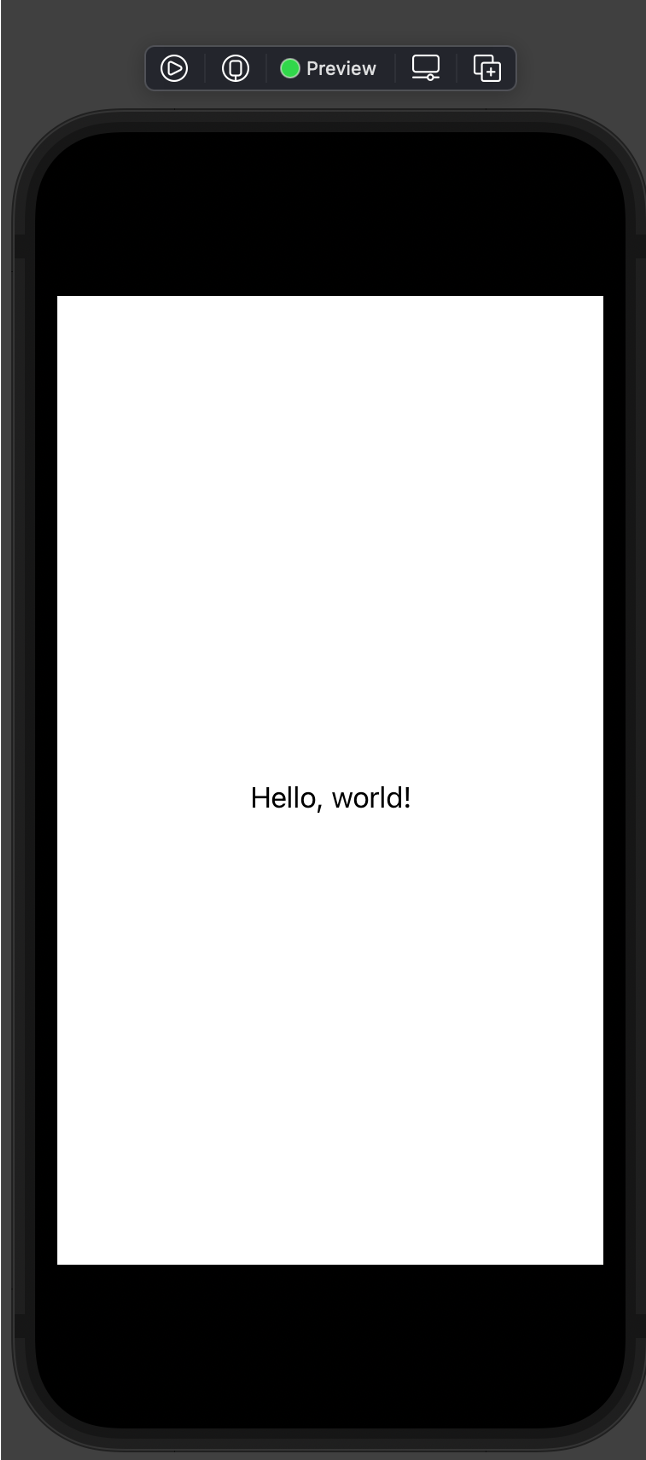
- Live preview
import SwiftUI

struct ContentView: View {
    var body: some View {
        Text("Hello, world!")
            .padding()
    }
}

#Preview {
    ContentView()
}
Preview macro supports multiple previews (and titles for them). So you can set up different previews for your design.
import SwiftUI

struct ContentView: View {
    var greeting:String

    var body: some View {
        Text(greeting)
            .padding()
    }
}

#Preview("Preview uno") {
    ContentView(greeting: "View 1")
}

#Preview("Secundo") {
    ContentView(greeting: "View 2")
}
some (swift 5.1)
- Some denotes opaque type (reverse of generics)
- Opaque types preserve type identity, and protocol types don’t.
- With a generic type, the caller of the function determines the concrete type of the placeholder (“outside”).
- With opaque types, the implementation determines the concrete type (“inside”).
- An opaque types always refers to one specific, concrete type – we just don’t know which one.
- A protocol type can refer to many types, as long as they conform to the protocol.
Stacks
- Body property of ContentView only describes a single view. To build up more complex views – embed views in stacks.
- Stack combine and embed multiple views - group views together horizontally, vertically, or back-to-front.
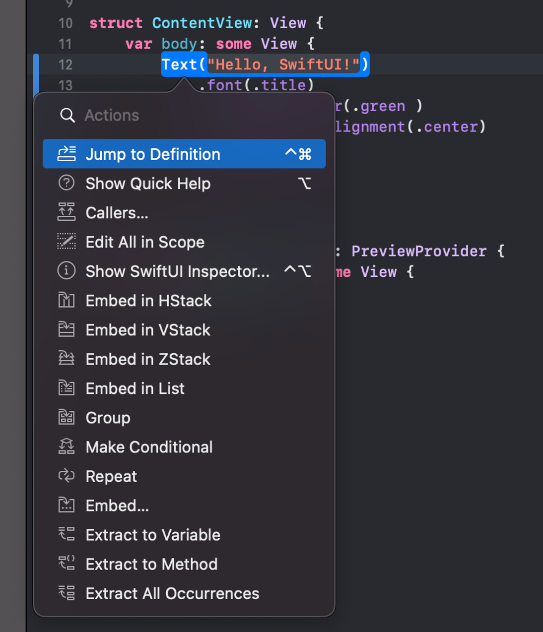
- CTrl-click on element to open structured editing popover.
- Embed element in stack
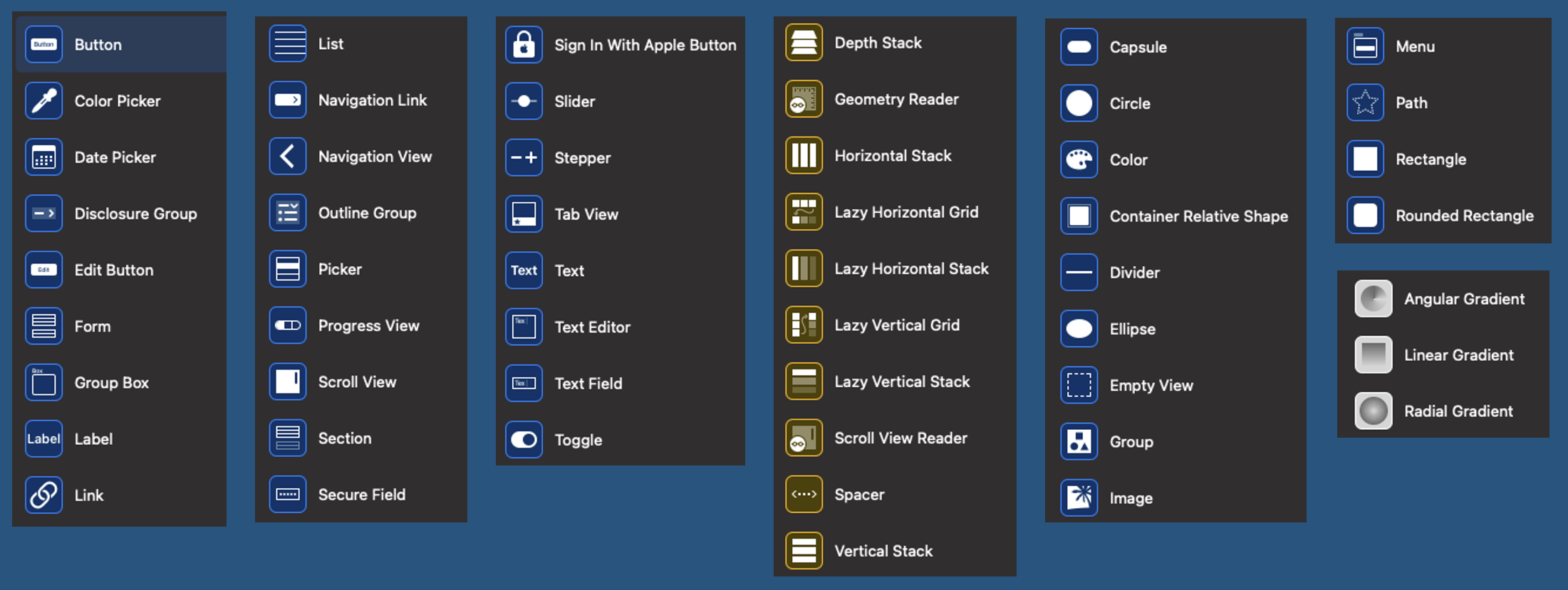
UI Elements
- Access library of possible elements from "plus" icon
- Drag elements onto code or live preview
- Controls, Layout, Other, Paints
Install Interactful from Mac App Store - nice tool to explore Swift UI elements.
https://apps.apple.com/us/app/interactful/id1528095640
And from HIG - https://developer.apple.com/design/human-interface-guidelines/components
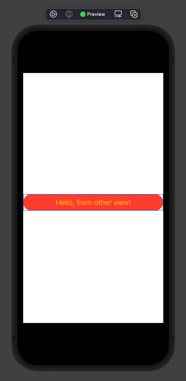
Combining views 1
Add new file, User Interface section, "SwiftUI View".
SubView.swift
import SwiftUI

struct SubView: View {
    var body: some View {
        ZStack {
            RoundedRectangle(cornerRadius: 50.0)
                .frame(width: nil, height: 38.0)
                .foregroundColor(.red)
            Text("Hello, from other view!")
                .foregroundColor(Color.yellow)
        }
    }
}

#Preview {
    SubView()
}
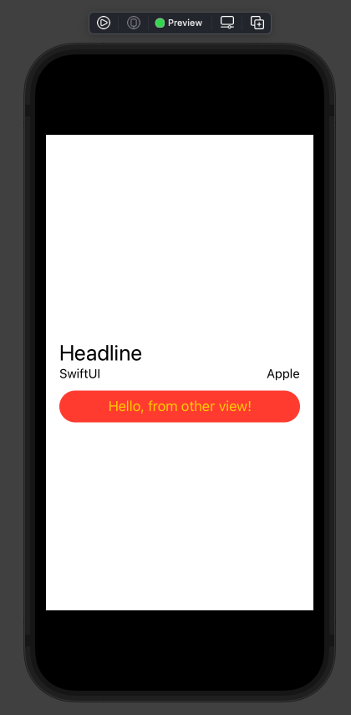
Combining views 2
import SwiftUI

struct ContentView: View {
    var body: some View {
        VStack(alignment: .leading) {
            HStack {
                Text("Headline")
                    .font(.title)
            }
            HStack {
                Text("SwiftUI")
                    .font(.subheadline)
                Spacer()
                Text("Apple")
                    .font(.subheadline)
            }
            SubView()
        }
        .padding()

    }
}

#Preview {
    ContentView()
}
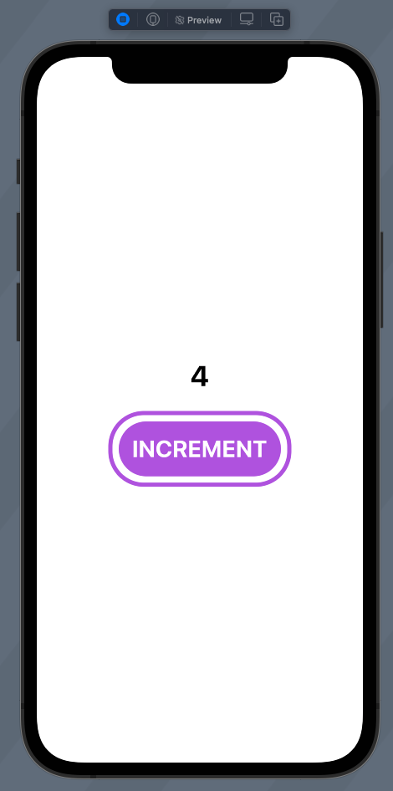
State in view
- Define local state variables with @State
- Modifying these causes view to invalidate and redraw needed parts
- Live preview
- Play icon
import SwiftUI

struct ContentView: View {
    @State private var counter = 0

    var body: some View {
        VStack {
            Text("\(counter)")
                .fontWeight(.bold)
                .font(.largeTitle)
                .padding()

            Button(action: {
                counter += 1
            }) {
                Text("INCREMENT")
                    .fontWeight(.bold)
                    .font(.title)
                    .padding()
                    .background(Color.purple)
                    .cornerRadius(40)
                    .foregroundColor(.white)
                    .padding(10)
                    .overlay(
                        RoundedRectangle(cornerRadius: 40)
                            .stroke(Color.purple, lineWidth: 5)
                    )
            }
        }
    }
}

#Preview {
    ContentView()
}
passing data to subView 1
In subview
- var somename: SomeType
- Constructor parameter, one-way param
- @Binding var somename: SomeType
- Two-way binding
- Use .constant to create constant value for preview
import SwiftUI

struct ImageLabelView: View {
    var imageName: String
    @Binding var email: String

    var body: some View {
        HStack {
            Image(systemName: imageName)
                .foregroundColor(.blue)
            Text(email)
        }
    }
}

#Preview {
    ImageLabelView(imageName: "envelope.fill", email: .constant("akaver@example.com"))
}
passing data to subView 2
- To pass state variable to binding property prefix it with $
import Foundation

struct User {
    var firstName: String
    var lastName: String
    var title: String
    var email: String
}
import SwiftUI

struct CardView: View {
    @State var user: User

    var body: some View {
        ZStack {
            Rectangle()
                .frame(width: 300, height: 100)
                .cornerRadius(20)
                .shadow(radius: 10)
                .foregroundColor(Color.orange)
            VStack(alignment: .leading){
                Text("\(user.firstName) \(user.lastName)")
                    .font(.title)
                Text(user.title)
                    .italic()
                Spacer()
                ImageLabelView(imageName: "envelope.fill", email: $user.email)
            }.padding()
                .frame(width: 300, height: 100)
        }
    }
}


#Preview {
    CardView(user: User(firstName: "First", lastName: "Last", title: "Title", email: "example@example.com"))
}
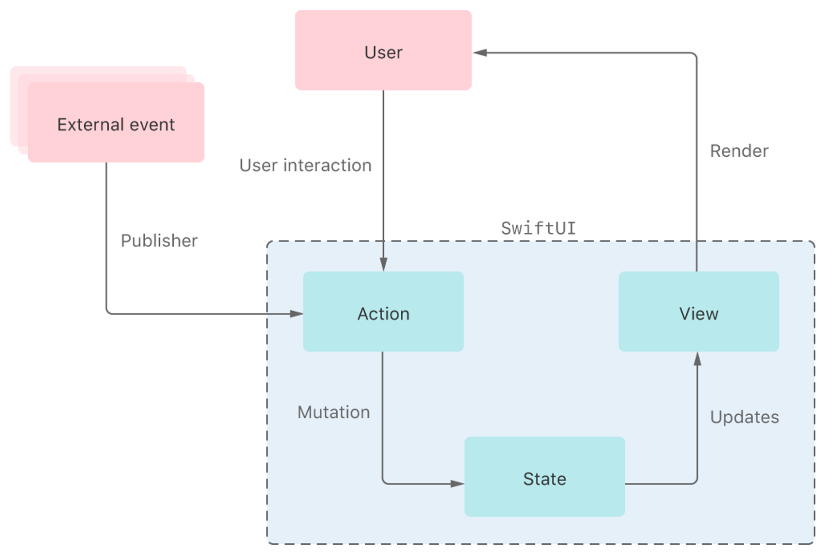
State and Data flow
Framework automatically performs most of the work traditionally done by view controllers – UI and state is synced
Navigation
- Embed view into NavigationView and create NavigationLinks
- NavigationLink specifies destination view and content
struct ContentView: View {
    var users: [User] = [
        User(firstName: "Mikk", lastName: "Raba", title: "TA", email: "mikk.raba@taltech.ee"),
        User(firstName: "Kerman", lastName: "Saapar", title: "TA", email: "kesaap@taltech.ee"),
        User(firstName: "Andres", lastName: "Käver", title: "Blabers a lot", email: "andres.kaver@taltech.ee"),
    ]

    var body: some View {
        NavigationView {
            ScrollView {
                VStack {
                    ForEach(users){user in
                        NavigationLink(destination: InfoView()) {
                            CardView(user: user)
                        }
                    }
                }
            }
        }
    }
}

#Preview {
    ContentView()
}
StateObject
- Use State and Binding for value types
- Use StateObject and ObservedObject for reference types
ForEach
- ForEach in SwiftUI is a view struct – can be returned directly from view body
- Provide array of items and how to identify items uniquely
        VStack(alignment: .leading) {
                    ForEach((1...10).reversed(), id: \.self) {
                        Text("\($0)...")
                    }
                }
- In structs use Identifiable protocol
Identifiable
Use Identifiable protocol to help SwiftUI uniquely detect elements
import Foundation

struct User: Identifiable {
    let id = UUID()
    var firstName: String
    var lastName: String
    var title: String
    var email: String
}

extension User {
    static let users = [
        User(firstName: "Andres", lastName: "Käver", title: "Teacher", email: "akaver@akaver.com"),
        User(firstName: "Kerman", lastName: "Saapar", title: "TA", email: "kerman@example.com"),
        User(firstName: "Mikk", lastName: "Raba", title: "TA", email: "mikk@example.com"),
    ]
}
animation, gesture
import SwiftUI

struct InfoView: View {
    @State var isScaled = false

    var body: some View {
        ZStack {
            RoundedRectangle(cornerRadius: 50.0)
                .frame(width: 300.0, height: 200.0)
            Text("Hello, World!")
                .foregroundColor(Color.white)
        }
        .scaleEffect(isScaled ? 1.2 : 1.0)
        .animation(.easeInOut(duration: 1.0), value: isScaled)
        .gesture(TapGesture()
            .onEnded {
                isScaled.toggle()
            })
    }
}


#Preview {
    InfoView()
}
Size classes
- Use @Environment
import SwiftUI

struct InfoView: View {
    @Environment(\.horizontalSizeClass) var horizontalSizeClass
    @Environment(\.verticalSizeClass) var verticalSizeClass

    @State var isScaled = false

    var body: some View {
        ZStack {
            RoundedRectangle(cornerRadius: 50.0)
                .frame(width: 300.0, height: 200.0)
            Text("Hello, \(horizontalSizeClass == .compact ? "hc" : "hr") \(verticalSizeClass == .compact ? "vc" : "vr")")
                .foregroundColor(Color.white)
        }
        .scaleEffect(isScaled ? 1.2 : 1.0)
        .animation(.easeInOut(duration: 1.0), value: isScaled)
        .gesture(TapGesture()
            .onEnded {
                isScaled.toggle()
            })
    }
}


#Preview {
    InfoView()
}
System icons
System icons can be explored using this:
https://developer.apple.com/sf-symbols/