05 - Jetpack Compose
Jetpack Compose Intro
In traditional Android development, UI development is handled using an imperative approach.
This means you explicitly tell the system what UI elements(views) to create and how to manipulate them at each step. You define the UI structure in XML layouts and then write code to find those views and update their properties (text, images, click listeners, etc.).
Jetpack Compose, on the other hand, takes a declarative approach.
You describe the desired UI state (what you want the UI to look like) in composable functions written in Kotlin. Compose handles the rendering logic itself, making your code more concise and easier to maintain.
//in layout XML file
<TextView
    android:id="@+id/text_view"
    android:layout_width="wrap_content"
    android:layout_height="wrap_content"
    android:text="Hello World!" />
//in Activity Kotlin class

val textView = findViewById<TextView>(R.id.text_view)
textView.text = "Updated Text"
vs
Text(text = "Hello World!")

// Later, to update the text:
Text(text = "Updated Text")
What are composable functions?
A composable function is a regular function marked with @Composable, which can call other composable functions.
A function is all you need to create a new UI component.
The annotation tells Compose to add special support to the function for updating and maintaining your UI over time.
Compose lets you structure your code into small chunks.
Composable functions are often referred to as "composables" for short.
@Composable
fun Greeting(name: String, modifier: Modifier = Modifier) {
    Text(
            text = "Hello $name!",
            modifier = modifier
        )
}
XML vs Compose
- TextView - Text
- EditText - TextField
- ImageView - Image
- Button - Button
- LinearLayout - Box
- FrameLayout - Box
- ConstraintLayout - BoxWithConstraints
- List - LazyColumn, LazyRow, Lazy Grids
- CardView - Card
AlertDialog, Scaffold, Surface, Icon, Spacer
Arrange UI elements on screen
The three basic standard layout elements in Compose are Column, Row and Box.
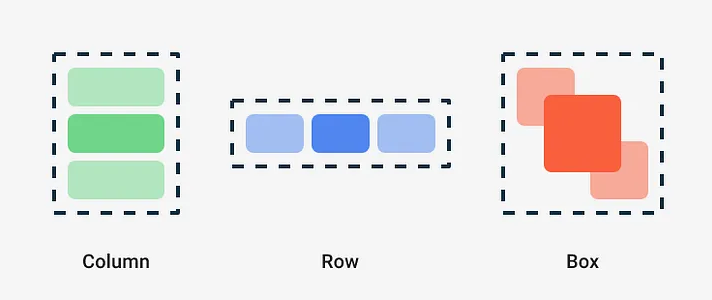
They are Composable functions that take Composable content, so you can place items inside.
Use Column to place items vertically on the screen.
@Composable
fun Item() {
    Column {
        Text("Title")
        Text("Description")
    }
}
Use Row to place items horizontally on the screen.
@Composable
fun Profile() {
    Row {
        Text("First Name")
        Text("Last Name")
    }
}
Use Box to put elements on top of another.
@Composable
fun AddProfilePic() {
    Box {
       Image(
        modifier = Modifier.clip(CircleShape),
        painter = painterResource(id = R.drawable.profile_avatar),
           contentDescription = null )
        Image(
            modifier = Modifier.align(Alignment.BottomEnd),
            painter = painterResource(id = R.drawable.add_icon),
            contentDescription = null )
    }
}
Modifiers
Modifiers allow you to decorate or augment a composable. Modifiers let you do these sorts of things:
- Change the composable’s size, layout, behavior, and appearance
- Add information, like accessibility labels
- Process user input
- Add high-level interactions, like making an element clickable, scrollable, draggable, or zoomable
The order of modifier functions is significant. Since each function makes changes to the Modifier returned by the previous function, the sequence affects the final result.
@Composable
fun ModifierExample() {
    Box(
        modifier = Modifier
            .size(50.dp)
            .clip(CircleShape)
            .background(Color.Blue)

    )
}
- Layout
- padding
- fillMaxSize
- wrapContentSize
- size
- offset
- align
- weight
- Drawing
- background
- border
- clip
- alpha
- shadow
- Interaction
- clickable
- toggleable
- draggable
- scrollable
- Animation
- animateContentSize
- graphicsLayer
- Gesture
- pointerInput
- nestedScroll
- Focus
- focusable
Tips
- Layout Modifiers First: Adjust the positioning, alignment, and spacing before setting size and drawing properties.
- Size Modifiers Next: Set the size after layout adjustments to ensure the correct dimensions are applied.
- Drawing Modifiers Last: Apply visual styles like backgrounds, borders, and shadows after all layout and size adjustments to ensure they render accurately.
https://developer.android.com/develop/ui/compose/modifiers
Reactivity
Composable functions are naturally reactive. When the data they depend on changes, the Compose runtime automatically triggers a recomposition of the affected parts of the UI. This reactivity is typically facilitated by state holders like mutableStateOf, which Compose tracks to determine when recomposition is needed.
// Composable Function to Display a Screen
@Composable
fun GreetingScreen() {
    // State Variable to Handle Button Clicks
    var count by remember { mutableStateOf(0) }

    // Column Layout for Organizing the Text and Button
    Column(
        modifier = Modifier
            .fillMaxSize()
            .padding(16.dp),
        verticalArrangement = Arrangement.Center
    ) {
        // Text Displaying the Count Value
        Text(text = "Button clicked $count times")

        Spacer(modifier = Modifier.height(16.dp))

        // Button with Click Handler to Update Count
        Button(onClick = { count++ }) {
            Text(text = "Click Me")
        }
    }
}
remember and mutableStateOf
Composable functions can use the remember API to store an object in memory. A value computed by remember is stored in the Composition during initial composition, and the stored value is returned during recomposition. Remember can be used to store both mutable and immutable objects.
mutableStateOf creates an observable MutableState, which is an observable type integrated with the compose runtime.
interface MutableState<T> : State<T> {
    override var value: T
}
Any changes to value schedules recomposition of any composable functions that read value.
There are three ways to declare a MutableState object in a composable:
val mutableState = remember { mutableStateOf(default) }
var value by remember { mutableStateOf(default) }
val (value, setValue) = remember { mutableStateOf(default) }
These declarations are equivalent, and are provided as syntax sugar for different uses of state.
The rememberSaveable API behaves similarly to remember because it retains state across recompositions, and also across activity or process recreation using the saved instance state mechanism.
For example, this happens, when the screen is rotated.
Types of State in Compose
Local State: This is state that is owned by a single composable and not shared outside of it. For example, a toggle that expands or collapses a section of text is typically a local state because it’s used only within that composable.
Hoisted State: The state is moved up to a shared parent component to make it easier to manage across different parts of the UI. This is especially useful when multiple composables need access to the same state.
Local state
@Composable
fun RememberMeExample() {
    var rememberMe by remember { mutableStateOf(false) }
    Checkbox(
        checked = rememberMe,
        onCheckedChange = { rememberMe = it }
    )
}
State Hoisting
State hoisting - state is moved up to a higher composable function to manage it in a more centralized way. This makes the state accessible to multiple composables, allowing for better separation of concerns and easier management of UI state.
// Root Composable Function
@Composable
fun MyApp() {
    // State Hoisting: State is managed at a higher level
    var count by remember { mutableStateOf(0) }

    // Passing state and update logic down to composables
    CounterScreen(count = count, onIncrement = { count++ })
}

// Composable Function that Displays Counter UI
@Composable
fun CounterScreen(count: Int, onIncrement: () -> Unit) {
    Column(
        modifier = Modifier
            .fillMaxSize()
            .padding(16.dp),
        verticalArrangement = Arrangement.Center
    ) {
        // Display the current count
        CounterText(count = count)

        Spacer(modifier = Modifier.height(16.dp))

        // Increment button that triggers state change via onIncrement
        CounterButton(onClick = onIncrement)
    }
}

// Reusable Composable to Display Count
@Composable
fun CounterText(count: Int) {
    Text(text = "You clicked $count times")
}

// Reusable Composable for Button
@Composable
fun CounterButton(onClick: () -> Unit) {
    Button(onClick = onClick) {
        Text(text = "Click Me")
    }
}
https://developer.android.com/develop/ui/compose/state-hoisting
Side Effects
Since composables can be recomposed frequently and unpredictably, managing side effects (operations like launching a network request or subscribing to a StateFlow) properly is crucial.
- LaunchedEffect: Use this for side effects that should only run once or need to be canceled and restarted based on specific conditions (key). It's useful for actions like fetching data or starting animations.
- DisposableEffect: Ideal for managing cleanup operations. It ensures that when a composable leaves the composition, any resources it used are properly released. This is crucial for avoiding memory leaks.
- rememberCoroutineScope: If you need to launch coroutines from a composable that need to be tied to the lifecycle of the composable, this provides a way to remember a coroutine scope that is canceled when the composable is removed from the composition.
@Composable
fun UserProfile(userId: String) {
    val userInfo = remember { mutableStateOf<User?>(null) }

LaunchedEffect(userId) {
        userInfo.value = userRepository.fetch(userId)
    }
    DisposableEffect(Unit) {
        onDispose {
            // Cleanup code here
        }
    }
    userInfo.value?.let { user ->
        Text("Hello, ${user.name}")
    }
}
- SideEffect : Control side effects that are idempotent and executed during composition.
You should use the SideEffect composable if you need to perform a side effect that is idempotent and that should only be executed once, even if the composable is recomposed multiple times. - rememberUpdatedState : Maintain a stable reference to a value, ensuring accurate updates during recomposition.
- ProduceState : Combine state and side effects, ensuring that UI display latest data.
- DerivedStateOf : Derived the state value from another state values.
//Composable with remember and LaunchedEffect
fun MyComposable(value: Int) {

    val state = remember { mutableStateOf("") }

    // Update the state variable with the user's name.
    LaunchedEffect(key1 = "keyName") {
        value = fetchUserName()
    }

    // Display the user's name.
    Text(text = state.value)
}

//Composable with produceState
fun MyComposableWithProduceState(value: Int) {

   val state = produceState(initialValue = "") {
      // Update the state variable with the user's name.
      value = fetchUserName()
   }

    // Display the user's name.
    Text(text = state.value)
 }
fun MyComposable(value: Int) {

   // Create a state variable that stores the user's name.
   val nameState = remember { mutableStateOf("") }

   // Create a new state variable that stores the user's name in uppercase.
   val nameInUpperCaseState = remember { derivedStateOf {
       // Convert the user's name to uppercase.
       return it.value.uppercase()
     }
   }

   // Display the user's name in uppercase.
   Text(text = nameInUpperCaseState.value)
}
Unidirectional data flow
A unidirectional data flow (UDF) is a design pattern where state flows down and events flow up. By following unidirectional data flow, you can decouple composables that display state in the UI from the parts of your app that store and change state.
The UI update loop for an app using unidirectional data flow looks like this:
- Event: Part of the UI generates an event and passes it upward, such as a button click passed to the ViewModel to handle or an event is passed from other layers of your app, such as indicating that the user session has expired.
- Update state: An event handler might change the state.
- Display state: The state holder passes down the state, and the UI displays it.
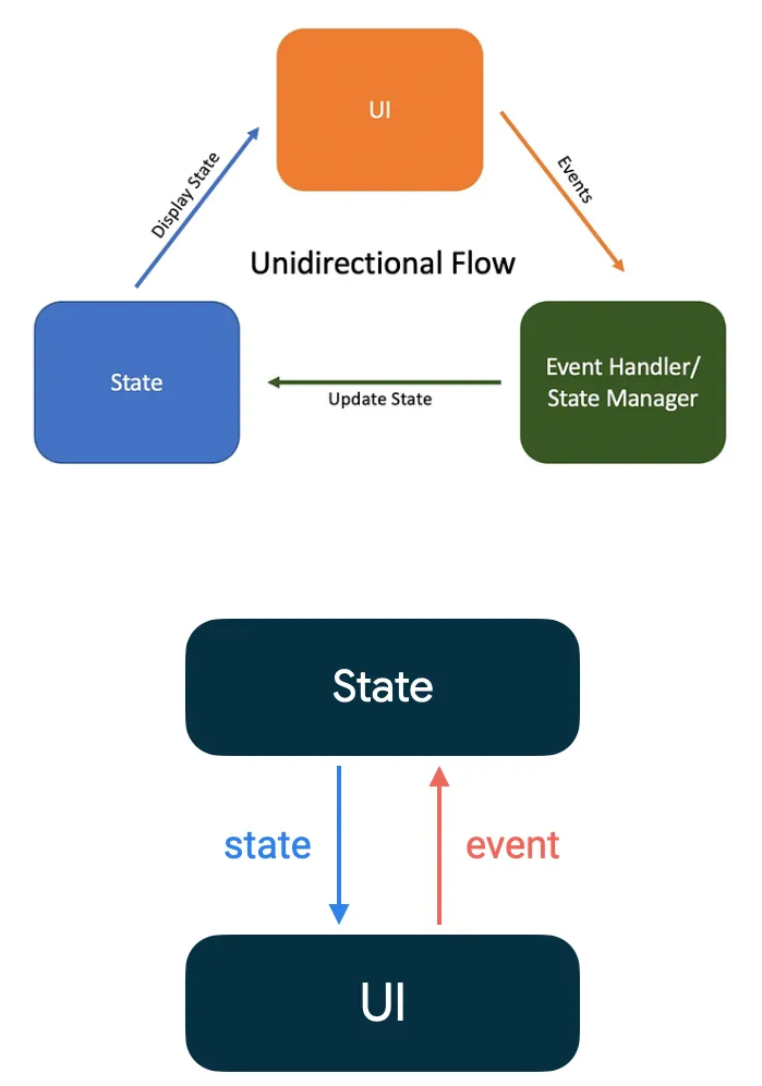
In Compose the UI is immutable — there’s no way to update it after it’s been drawn. What you can control is the state of your UI. Every time the state of the UI changes, Compose recreates the parts of the UI tree that have changed. Composables can accept state and expose events — for example, a TextField accepts a value and exposes a callback onValueChange that requests the callback handler to change the value.
var name by remember { mutableStateOf("") }
OutlinedTextField(
    value = name,
    onValueChange = { name = it },
    label = { Text("Name") }
)
Example
https://m3.material.io/develop/android/jetpack-compose
@Composable
fun LoginPage() {
    val context = LocalContext.current
    Box(modifier = Modifier.fillMaxSize()) {
        ClickableText(
            text = AnnotatedString("Sign up here"),
            modifier = Modifier
                .align(Alignment.BottomCenter)
                .padding(20.dp),
            onClick = {
                Toast.makeText(context, "Work in-progress", Toast.LENGTH_SHORT).show()
            },
            style = TextStyle(
                fontSize = 14.sp,
                fontFamily = FontFamily.Default,
                textDecoration = TextDecoration.Underline,
                color = PurpleGrey40
            )
        )
    }
    Column(
        modifier = Modifier
            .fillMaxSize()
            .padding(20.dp),
        verticalArrangement = Arrangement.Center,
        horizontalAlignment = Alignment.CenterHorizontally
    ) {

        val username = remember { mutableStateOf(TextFieldValue()) }
        val password = remember { mutableStateOf(TextFieldValue()) }

        Text(text = "Login", style = TextStyle(fontSize = 40.sp, fontFamily = FontFamily.Default))

        Spacer(modifier = Modifier.height(20.dp))
        TextField(
            label = { Text(text = "Mobile Number") },
            value = username.value,
            keyboardOptions = KeyboardOptions(keyboardType = KeyboardType.Phone),
            onValueChange = { username.value = it })

        Spacer(modifier = Modifier.height(20.dp))
        TextField(
            label = { Text(text = "Password") },
            value = password.value,
            visualTransformation = PasswordVisualTransformation(),
            keyboardOptions = KeyboardOptions(keyboardType = KeyboardType.Password),
            onValueChange = { password.value = it })

        Spacer(modifier = Modifier.height(20.dp))
        Box(modifier = Modifier.padding(40.dp, 0.dp, 40.dp, 0.dp)) {
            Button(
                onClick = {
                    ContextCompat.startActivity(
                        context,
                        Intent(context, MainActivity::class.java),
                        null
                    )
                },
                shape = RoundedCornerShape(50.dp),
                modifier = Modifier
                    .fillMaxWidth()
                    .height(50.dp)
            ) {
                Text(text = "Login")
            }
        }

        Spacer(modifier = Modifier.height(20.dp))
        ClickableText(
            text = AnnotatedString("Forgot password?"),
            onClick = {
                Toast.makeText(context, "Work in-progress", Toast.LENGTH_SHORT).show()
            },
            style = TextStyle(
                fontSize = 14.sp,
                fontFamily = FontFamily.Default
            )
        )
    }
}
Jetpack Compose - ViewModel
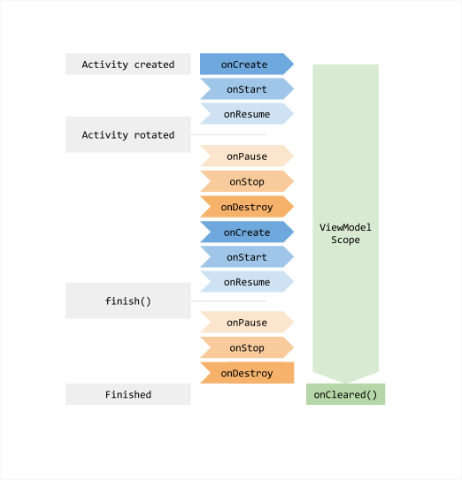
The ViewModel class is a business logic or screen level state holder. It exposes state to the UI and encapsulates related business logic. Its principal advantage is that it caches state and persists it through configuration changes. This means that your UI doesn’t have to fetch data again when navigating between activities, or following configuration changes, such as when rotating the screen.
When you instantiate a ViewModel, you pass it an object that implements the ViewModelStoreOwner interface - activity, fragment, etc. A range of classes are either direct or indirect subclasses of the ViewModelStoreOwner interface.
SavedStateHandle allows you to persist data not just through configuration changes, but across process recreation.
That is, it enables you to keep the UI state intact even when the user closes the app and opens it at a later time.
Even though the vast majority of business logic is present in the data layer, ViewModel is the right place to handle business logic in the UI layer. The ViewModel is also in charge of handling events and delegating them to other layers of the hierarchy when business logic needs to be applied to modify application data.
When using Jetpack Compose, ViewModel is the primary means of exposing screen UI state to your composables.
The most important thing to keep in mind when using ViewModel with Compose is that you cannot scope a ViewModel to a composable (composable is not a ViewModelStoreOwner).
Observability in VieModel
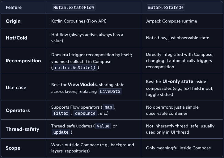
Two main methods:
- mutableStateOf
- MutableStateFlow
data class DiceUiState(
    val firstDieValue: Int? = null,
    val secondDieValue: Int? = null,
    val numberOfRolls: Int = 0,
)

class DiceRollViewModel : ViewModel() {

    // Expose screen UI state
    private val _uiState = MutableStateFlow(DiceUiState())
    val uiState: StateFlow<DiceUiState> = _uiState.asStateFlow()

    // Handle business logic
    fun rollDice() {
        _uiState.update { currentState ->
            currentState.copy(
                firstDieValue = Random.nextInt(from = 1, until = 7),
                secondDieValue = Random.nextInt(from = 1, until = 7),
                numberOfRolls = currentState.numberOfRolls + 1,
            )
        }
    }
}
import androidx.lifecycle.viewmodel.compose.viewModel

// Use the 'viewModel()' function from the lifecycle-viewmodel-compose artifact
@Composable
fun DiceRollScreen(
    viewModel: DiceRollViewModel = viewModel()
) {
    val uiState by viewModel.uiState.collectAsStateWithLifecycle()
    // Update UI elements
    Text(text = uiState.numberOfRolls)
}
}
The lifecycle of a ViewModel
Kotlin Coroutines
To create applications that perform multiple tasks at once, a concept known as concurrency, Kotlin uses coroutines. A coroutine is a suspendable computation that lets you write concurrent code in a clear, sequential style. Coroutines can run concurrently with other coroutines and potentially in parallel.

suspend fun greet() {
    println("Hello world from a suspending function")
}
You can only call a suspending function from another suspending function.
To create a coroutine in Kotlin, you need the following:
- suspending function.
- coroutine scope in which it can run, for example inside the withContext() function.
- coroutine builder like CoroutineScope.launch() to start it.
- dispatcher to control which threads it uses.
// Imports the coroutines library
import kotlinx.coroutines.*

// Imports the kotlin.time.Duration to express duration in seconds
import kotlin.time.Duration.Companion.seconds

// Defines a suspending function
suspend fun greet() {
    println("The greet() on the thread: ${Thread.currentThread().name}")
    // Suspends for 1 second and releases the thread
    delay(1.seconds)
    // The delay() function simulates a suspending API call here
    // You can add suspending API calls here like a network request
}

suspend fun main() {
    // Runs the code inside this block on a shared thread pool
    withContext(Dispatchers.Default) { // this: CoroutineScope
        this.launch() {
            greet()
        }

        // Starts another coroutine
        this.launch() {
            println("The CoroutineScope.launch() on the thread: ${Thread.currentThread().name}")
            delay(1.seconds)
            // The delay function simulates a suspending API call here
            // You can add suspending API calls here like a network request
        }

        println("The withContext() on the thread: ${Thread.currentThread().name}")
    }
}
Coroutine builder functions
A coroutine builder function is a function that accepts a suspend lambda that defines a coroutine to run. Here are some examples:
- CoroutineScope.launch()
- CoroutineScope.async()
- runBlocking()
- withContext()
- coroutineScope()
CoroutineScope.launch() starts a new coroutine without blocking the rest of the scope, inside an existing coroutine scope.
CoroutineScope.async() starts a concurrent computation inside an existing coroutine scope and returns a Deferred handle that represents an eventual result. Use the .await() function to suspend the code until the result is ready.
suspend fun main() = withContext(Dispatchers.Default) { // this: CoroutineScope
    // Starts downloading the first page
    val firstPage = this.async {
        delay(50.milliseconds)
        "First page"
    }

    // Starts downloading the second page in parallel
    val secondPage = this.async {
        delay(100.milliseconds)
        "Second page"
    }

    // Awaits both results and compares them
    val pagesAreEqual = firstPage.await() == secondPage.await()
    println("Pages are equal: $pagesAreEqual")
}
Use runBlocking() only when there is no other option to call suspending code from non-suspending code.
// A third-party interface you can't change
interface Repository {
    fun readItem(): Int
}

object MyRepository : Repository {
    override fun readItem(): Int {
        // Bridges to a suspending function
        return runBlocking {
            myReadItem()
        }
    }
}

suspend fun myReadItem(): Int {
    delay(100.milliseconds)
    return 4
}
Coroutine dispatchers
A coroutine dispatcher controls which thread or thread pool coroutines use for their execution.
- Dispatchers.Default - shared pool of threads on JVM and Native, the maximum number of threads used by this dispatcher is equal to the number of CPU cores, but is at least two.
- Dispatchers.IO - for offloading blocking IO tasks to a shared pool of threads.
- Dispatchers.Main - confined to the Main thread operating with UI objects, uually such dispatchers are single-threaded
Android Coroutines
Blocks UI thread...
class LoginViewModel(
    private val loginRepository: LoginRepository
): ViewModel() {

    fun login(username: String, token: String) {
        val jsonBody = "{ username: \"$username\", token: \"$token\"}"
        loginRepository.makeLoginRequest(jsonBody)
    }
}
Non-blocking
class LoginViewModel(
    private val loginRepository: LoginRepository
): ViewModel() {

    fun login(username: String, token: String) {
        // Create a new coroutine to move the execution off the UI thread
        viewModelScope.launch(Dispatchers.IO) {
            val jsonBody = "{ username: \"$username\", token: \"$token\"}"
            loginRepository.makeLoginRequest(jsonBody)
        }
    }
}
viewModelScope is a predefined CoroutineScope that is included with the ViewModel KTX extensions.
class LoginRepository(...) {
    ...
    suspend fun makeLoginRequest(
        jsonBody: String
    ): Result<LoginResponse> {

        // Move the execution of the coroutine to the I/O dispatcher
        return withContext(Dispatchers.IO) {
            // Blocking network request code
        }
    }
}
class LoginViewModel(
    private val loginRepository: LoginRepository
): ViewModel() {

    fun login(username: String, token: String) {

        // Create a new coroutine on the UI thread
        viewModelScope.launch {
            val jsonBody = "{ username: \"$username\", token: \"$token\"}"

            // Make the network call and suspend execution until it finishes
            val result = loginRepository.makeLoginRequest(jsonBody)

            // Display result of the network request to the user
            when (result) {
                is Result.Success<LoginResponse> -> // Happy path
                else -> // Show error in UI
            }
        }
    }
}
Flow
https://developer.android.com/kotlin/flow
Flow is a class from Kotlin’s Coroutines library introduced in 2019 which represents a stream of values computed asynchronously.