03 - Android Layout
Layout
- Basic layout
- Linear
- Constraint
- Grid
- Basic attributes
- Size
- Margin vs padding
- Gravity
Defines declaratively visual structure for app
Takes into consideration screen properties
- size
- pixel density
System calculates sizes and position for all UI elements
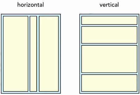
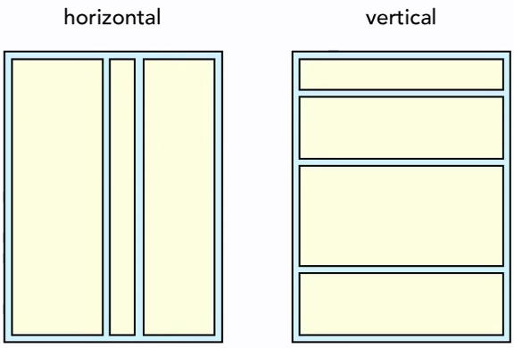
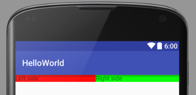
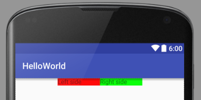
LinearLayout
Arranges its children in single direction
Orientation="horizontal"Orientation="vertical"
Basic attributes
Used across all layouts
- Size
- Margin vs padding
- Gravity
Size
- Match_parent
- Wrap_content
1 2 3 4 5 6 7 8 9 10 11 12 13 | |
- Use background tint for visual cues
1 | |
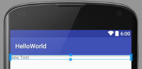
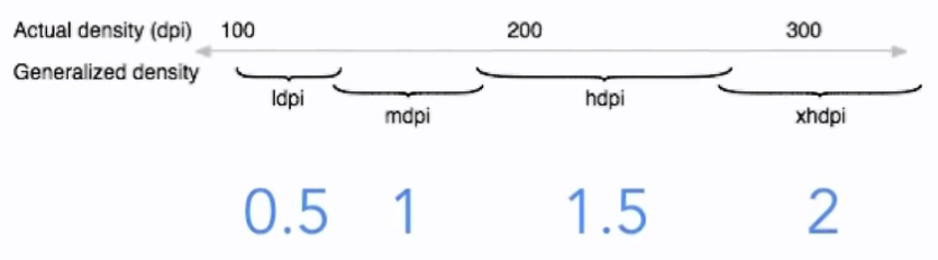
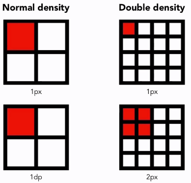
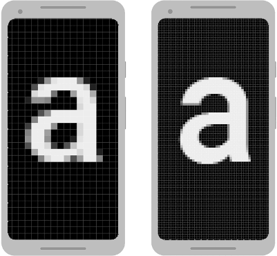
DP
xxxdp- Density-independent pixel
- px = dp * density
- density = bucket(dpi/160)
Margin and Padding
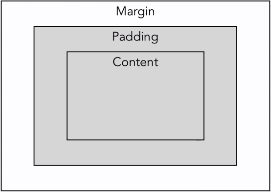
- No margin
- android:padding
- android:layout_margin
- layout_xxx prefix – deals with data from outside the view
- padding – inside the view
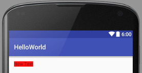
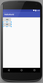
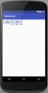
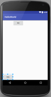
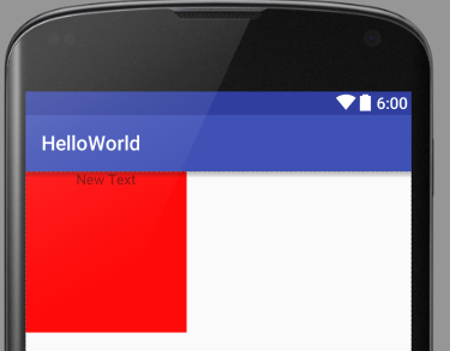
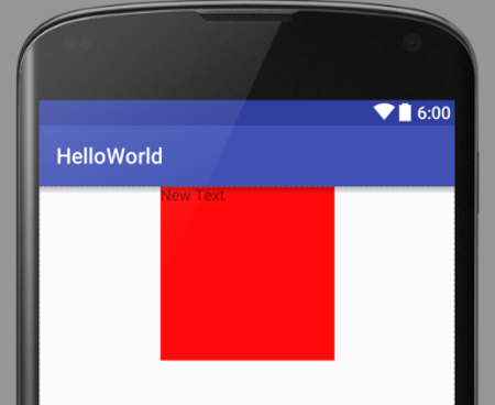
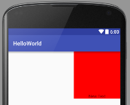
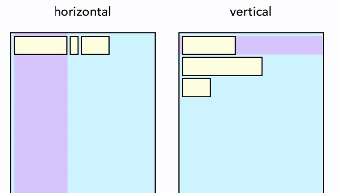
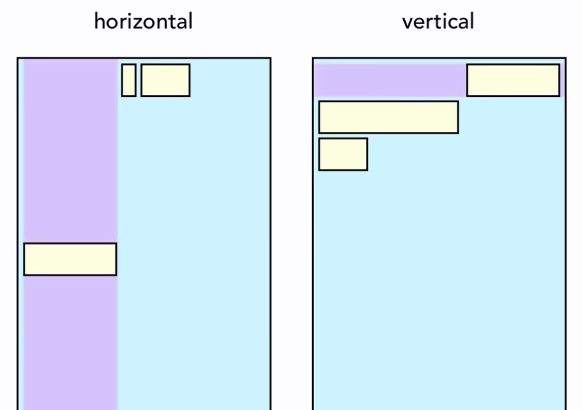
Gravity
- Android:layout_gravity
- Position of the view, regarding its parent
- Android:gravity
- Position of the content inside the view
1 2 3 4 5 6 7 8 9 10 11 12 13 14 15 | |
1 2 3 4 5 6 7 8 9 10 11 12 13 14 | |
Can be mixed and combined
1 2 3 4 5 6 7 8 9 10 11 12 13 14 | |
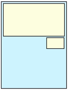
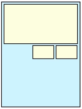
LinearLayout
- What is LinearLayout?
- Gravity
- Weight
- Nested layout
Gravity
Weight
- Additional way to specify dimensions (match_parent, wrap_content, xxxdp)
- Adds weights together
- Width is based on ratios (1+1=2 => ½ and ½)
- Can be mixed every way
weightSum
1 2 3 4 5 6 7 8 9 10 11 12 13 14 15 16 17 18 19 20 21 22 23 24 25 | |
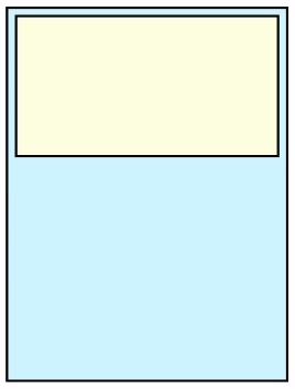
Nested Layouts
Layouts can contain other layouts
1 2 3 4 5 6 7 8 9 10 11 12 13 14 15 16 17 18 19 20 21 22 23 24 25 26 27 28 29 30 | |
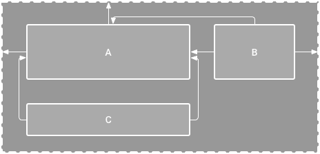
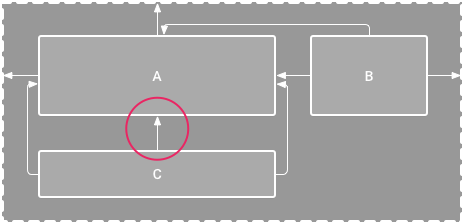
ConstraintLayout
ConstraintLayout allows you to create large and complex layouts with a flat view hierarchy (no nested view groups) - performant.
- Relative
- Position
- Alignment
- To
- Parent
- Sibling
- Every element needs at least one horizontal and one vertical constraint.
- Constraint can connect to
- Another element
- Parent layout
- Guideline
Adding constraints
- Add constraint – drag from the connection handle (the circle)
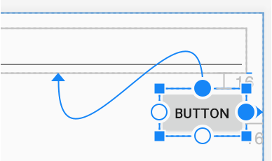
- Or click the + sign in Attributes panel
- Each constraint handle can be used for just one constraint
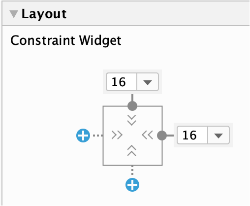
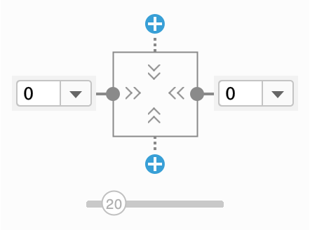
- When you add opposing constraints to fixed size element, element will be centered. Change bias via slider.
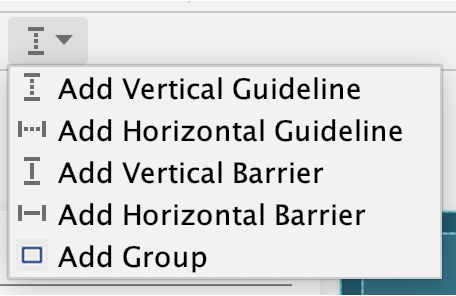
Guideline and Barrier
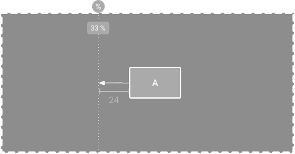
- Guideline
- You can add a vertical or horizontal guideline to which you can constrain views, and the guideline will be invisible to app users.
- You can position the guideline within the layout based on either dp units or percent, relative to the layout's edge.
- click on top of guidelines small icon (hard to get exact click area right) to toggle between from "left edge, right edge, percentage"
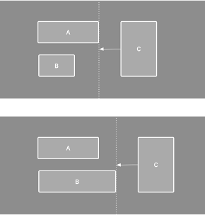
- Barrier
- Invisible line that you can constrain views to.
- Except a barrier does not define its own position; instead, the barrier position moves based on the position of views contained within it.
View size
- Fixed: You specify a specific dimension in the text box below or by resizing the view in the editor.

- Wrap Content: The view expands only as much as needed to fit its contents.

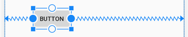
- Match Constraints: The view expands as much as possible to meet the constraints on each side (after accounting for the view's margins).

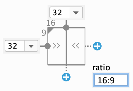
- Size as ratio – (click the upper left corner)
- You can set the view size to a ratio such as 16:9 if at least one of the view dimensions is set to "match constraints" (0dp).
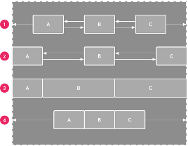
Chain
- A chain is a group of views that are linked to each other with bi-directional position constraints.
- Select elements to be in chain, right click, select Chains. Chain head sets the style: spread, spread inside, weighted, packed
- Spread: The views are evenly distributed (after margins are accounted for). This is the default.
- Spread inside: The first and last view are affixed to the constraints on each end of the chain and the rest are evenly distributed.
- Weighted: When the chain is set to either spread or spread inside, you can fill the remaining space by setting one or more views to "match constraints" and use layout_constraintHorizontal_weight and layout_constraintVertical_weight
- Packed: The views are packed together (after margins are accounted for)
Visiblity
Missing views - Visibility
- Invisible – view is hidden, layout stays the same
- Gone – view is semi-removed, layout falls apart
Reusing layouts
- To efficiently re-use complete layouts, you can use the
<include/>and<merge/>tags to embed another layout inside the current layout.<include layout="@layout/game_board"/> - Override layout parameters (any
android:layout_*attributes) of the included layout's root view by specifying them in the<include/>tag. -
You must override both
android:layout_heightandandroid:layout_widthin order for other layout attributes to take effect. -
The
<merge />tag helps eliminate redundant view groups in your view hierarchy when including one layout within another. - Include this layout in another layout (using the
<include/>tag) - the system ignores the<merge>element and places the two buttons directly in the layout, in place of the<include/>tag.
1 2 3 4 5 6 7 8 9 10 11 12 13 | |