React & Next.js Fundamentals
React vs Vue
You already know Vue -- React solves the same problems with a different philosophy. Here's the key mapping:
| Concept | Vue | React |
|---|---|---|
| Template | <template> HTML-based | JSX (JS returns markup) |
| Two-way binding | v-model | Controlled components |
| Conditional | v-if, v-show | &&, ternary, early return |
| List rendering | v-for | .map() |
| Events | @click | onClick |
| Reactivity | ref(), reactive() | useState() |
| Computed | computed() | useMemo() |
| Side effects | watch(), onMounted() | useEffect() |
| Composables | useXxx() composable | Custom hook useXxx() |
| Slots | <slot> | children prop |
| State management | Pinia | Context, Zustand |
The biggest difference: Vue uses HTML-based templates with special directives (v-if, v-for, v-model). React uses JSX -- you write markup directly in JavaScript. There are no directives -- everything is plain JavaScript expressions.
Why a framework?
Plain React usage is not recommended anymore (although possible). Most apps eventually build solutions for routing, data fetching, code-splitting, and server-side rendering.
Framework options:
- Next.js -- the most popular, used in this course
- Remix
- Gatsby
- Expo (mobile)
Next.js Setup
Use create-next-app with App Router (the default since Next.js 13.4):
npx create-next-app@latest
Choose your options:
- App Router (default, yes)
- TypeScript (yes)
- ESLint (yes)
- Tailwind or Bootstrap? (Bootstrap -- since ASP.NET course uses it too)
Project structure
src/app/
├── layout.tsx      # Root layout (wraps all pages)
├── page.tsx        # Home page (/)
├── globals.css     # Global styles
└── dashboard/
    └── page.tsx    # Dashboard page (/dashboard)
Clean up initial code
- Empty
globals.cssandpage.module.css - Clean out
page.tsx
export default function Home() {
  return (
    <main>
      <h1>Hello, World!</h1>
    </main>
  );
}
Add Bootstrap support
npm install bootstrap
Modify layout.tsx:
import type { Metadata } from "next";
import "bootstrap/dist/css/bootstrap.css";
import { Inter } from "next/font/google";
import "./globals.css";

const inter = Inter({ subsets: ["latin"] });

export const metadata: Metadata = {
  title: "Create Next App",
  description: "Generated by create next app",
};

export default function RootLayout({
  children,
}: Readonly<{ children: React.ReactNode }>) {
  return (
    <html lang="en">
      <body className={inter.className}>{children}</body>
    </html>
  );
}
Modify page.tsx to test Bootstrap:
export default function Home() {
  return (
    <main>
      <h1 className="text-danger">Hello Bootstrap</h1>
    </main>
  );
}
Bootstrap JS support
Bootstrap JS components (accordion, dropdown, modal) need JavaScript. Create src/components/BootstrapActivation.tsx:
"use client";

import { useEffect } from "react";

export default function BootstrapActivation() {
  useEffect(() => {
    import("bootstrap/dist/js/bootstrap.bundle.min.js");
  }, []);

  return null;
}
Add it to layout.tsx:
import type { Metadata } from "next";
import "bootstrap/dist/css/bootstrap.css";
import { Inter } from "next/font/google";
import "./globals.css";
import BootstrapActivation from "@/components/BootstrapActivation";

const inter = Inter({ subsets: ["latin"] });

export const metadata: Metadata = {
  title: "Create Next App",
  description: "Generated by create next app",
};

export default function RootLayout({
  children,
}: Readonly<{ children: React.ReactNode }>) {
  return (
    <html lang="en">
      <body className={inter.className}>
        {children}
        <BootstrapActivation />
      </body>
    </html>
  );
}
Test with an accordion in page.tsx:
export default function Home() {
  return (
    <main>
      <div className="text-center mt-4 col-md-6 mx-auto">
        <h1 className="text-danger">Hello Bootstrap</h1>

        <div className="accordion" id="accordionExample">
          <div className="accordion-item">
            <h2 className="accordion-header" id="headingOne">
              <button
                className="accordion-button"
                type="button"
                data-bs-toggle="collapse"
                data-bs-target="#collapseOne"
                aria-expanded="true"
                aria-controls="collapseOne"
              >
                Accordion Item #1
              </button>
            </h2>
            <div
              id="collapseOne"
              className="accordion-collapse collapse show"
              aria-labelledby="headingOne"
              data-bs-parent="#accordionExample"
            >
              <div className="accordion-body">
                <strong>This is the first accordion body.</strong>
              </div>
            </div>
          </div>
          <div className="accordion-item">
            <h2 className="accordion-header" id="headingTwo">
              <button
                className="accordion-button collapsed"
                type="button"
                data-bs-toggle="collapse"
                data-bs-target="#collapseTwo"
                aria-expanded="false"
                aria-controls="collapseTwo"
              >
                Accordion Item #2
              </button>
            </h2>
            <div
              id="collapseTwo"
              className="accordion-collapse collapse"
              aria-labelledby="headingTwo"
              data-bs-parent="#accordionExample"
            >
              <div className="accordion-body">
                <strong>This is the second accordion body.</strong>
              </div>
            </div>
          </div>
        </div>
      </div>
    </main>
  );
}
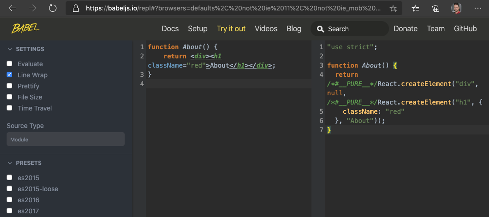
JSX
React uses a markup syntax called JSX -- HTML written directly in JavaScript. It compiles to JavaScript function calls.
function About() {
  return <h1>About</h1>;
}
Compiles to (you never write this manually):
// Automatic JSX transform (React 17+)
import { jsx as _jsx } from "react/jsx-runtime";
function About() {
  return _jsx("h1", { children: "About" });
}
You can see this in action at babeljs.io.
JSX Properties
Since JSX compiles to JavaScript, some HTML attribute names conflict with JS reserved words:
class->classNamefor->htmlFor- Attributes are camelCased:
tabindex->tabIndex,onclick->onClick
Expressions in JSX
Use {} to embed any JavaScript expression (not statements!) in JSX:
const name = "World";
return <h1>Hello {name}!</h1>;
Inline styles
Inline styles use a JavaScript object (double curly braces -- outer {} for expression, inner {} for the object):
function About() {
  return (
    <h1
      style={{
        color: "red",
        height: 20,
        fontSize: "2rem",
      }}
    >
      About
    </h1>
  );
}
In Vue, you write <h1 :style="{ color: 'red' }">. In React, it's <h1 style={{ color: "red" }}>. Same concept, slightly different syntax.
Conditional rendering
In Vue you use v-if and v-show. In React, you use plain JavaScript:
// Ternary operator (like v-if / v-else)
{isLoggedIn ? <Dashboard /> : <Login />}

// Logical AND (like v-if without else)
{showError && <ErrorMessage />}

// Early return (common pattern for loading states)
function Page() {
  if (isLoading) return <Spinner />;
  if (error) return <ErrorAlert message={error} />;
  return <Content data={data} />;
}
List rendering
In Vue you use v-for. In React, you use .map():
const items = ["Apple", "Banana", "Cherry"];

return (
  <ul>
    {items.map((item) => (
      <li key={item}>{item}</li>
    ))}
  </ul>
);
Every element in a .map() must have a unique key prop. Use IDs from your data, not array indices.
Components
In modern React, components are functions that return JSX. There are two equivalent syntaxes:
Function component
function About() {
  return <h1>About</h1>;
}
Arrow function component
const About = () => <h1>About</h1>;
Both are equivalent. Use whichever style your team prefers.
Component rules
- Component names must start with a capital letter. JSX assumes lowercase = HTML element, uppercase = React component.
- Use parentheses around multiline JSX:
return ( <div>...</div> ); - JSX can only have one top-level element. Use fragments
<>...</>to wrap multiple elements without adding extra DOM nodes.
// Fragment -- avoids unnecessary wrapper divs
const Page = () => (
  <>
    <Header />
    <Main />
    <Footer />
  </>
);
Vue SFCs have separate <template>, <script>, <style> blocks. React components put everything in one .tsx file -- the function IS the component.
Component example
const Privacy = () => <h1>Privacy</h1>;
export default Privacy;
const Home = () => <h1>Home</h1>;
export default Home;
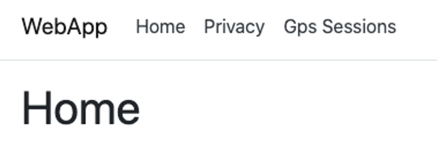
Navbar component (from ASP.NET HTML)
When converting HTML from ASP.NET, remember: class -> className.
This example uses plain <a> tags. We will replace them with Next.js <Link> components in the routing lecture for proper client-side navigation.
class -> className
const Header = () => (
  <header>
    <nav className="navbar navbar-expand-sm navbar-toggleable-sm navbar-light bg-white border-bottom box-shadow mb-3">
      <div className="container">
        <a className="navbar-brand" href="/">
          WebApp
        </a>
        <button
          className="navbar-toggler"
          type="button"
          data-bs-toggle="collapse"
          data-bs-target=".navbar-collapse"
          aria-controls="navbarSupportedContent"
          aria-expanded="false"
          aria-label="Toggle navigation"
        >
          <span className="navbar-toggler-icon"></span>
        </button>
        <div className="navbar-collapse collapse d-sm-inline-flex flex-sm-row-reverse">
          <ul className="navbar-nav flex-grow-1">
            <li className="nav-item">
              <a className="nav-link text-dark" href="/">
                Home
              </a>
            </li>
            <li className="nav-item">
              <a className="nav-link text-dark" href="/privacy">
                Privacy
              </a>
            </li>
          </ul>
        </div>
      </div>
    </nav>
  </header>
);

export default Header;
Data in React
React uses one-way data binding (unlike Vue's v-model which provides two-way binding).
Data lives in two places:
- Props -- passed down from parent (immutable in the receiving component)
- State -- owned by the component (mutable via setter functions)
Props work the same as Vue's defineProps. State is like Vue's ref() / reactive(). The difference: React has no built-in v-model -- you manually wire value + onChange.
Props
Props are the React equivalent of Vue's defineProps. They pass data from parent to child.
Untyped (avoid this)
const Privacy = (props: any) => <h1>Privacy {props.message}</h1>;
Typed with interface (preferred)
interface PrivacyProps {
  message: string;
}

const Privacy = (props: PrivacyProps) => <h1>Privacy {props.message}</h1>;
Destructured props (cleanest)
interface PrivacyProps {
  message: string;
}

const Privacy = ({ message }: PrivacyProps) => <h1>Privacy {message}</h1>;
Usage
<Privacy message="is important!" />
Optional props and defaults
interface PrivacyProps {
  message: string;
  showIt?: boolean;
}

const Privacy = ({ message, showIt = false }: PrivacyProps) => (
  <h1>Privacy {showIt ? message : "is disabled"}</h1>
);
The children prop
React's equivalent of Vue's <slot>. Any JSX nested inside a component is passed as children:
interface CardProps {
  title: string;
  children: React.ReactNode;
}

const Card = ({ title, children }: CardProps) => (
  <div className="card">
    <div className="card-header">{title}</div>
    <div className="card-body">{children}</div>
  </div>
);

// Usage
<Card title="Welcome">
  <p>This content goes into the children prop.</p>
  <button>Click me</button>
</Card>
Vue uses named slots (<slot name="header">). React passes everything as children, or you can pass JSX as regular props for "named slot" behavior.
Key prop
Keys help React identify which items have changed, are added, or removed in lists.
- Use a unique ID from your data as the key
- Keys must be unique among siblings (not globally)
- Do not use array index as key if items can be reordered or filtered
- The
keyprop goes on the outermost element returned by.map()
{items.map((item) => (
  <ItemRow key={item.id} item={item} />
))}
Server Components vs Client Components
In Next.js App Router, components are Server Components by default. They run on the server and send HTML to the browser.
Server Components (default):
- Can directly access databases, file system, environment variables
- Cannot use hooks (
useState,useEffect, etc.) - Cannot use browser APIs (
window,document, etc.) - Cannot use event handlers (
onClick,onChange, etc.)
Client Components (add "use client" at the top):
- Can use hooks and browser APIs
- Can handle user interactions
- Ship JavaScript to the browser
"use client";

import { useState } from "react";

export default function Counter() {
  const [count, setCount] = useState(0);
  return <button onClick={() => setCount(count + 1)}>Count: {count}</button>;
}
Rule of thumb: Start with Server Components. Add "use client" only when you need interactivity (hooks, event handlers, browser APIs).
Vue/Nuxt also supports server-side rendering, but all components are "universal" by default. In Next.js, you explicitly choose server vs client per component.
Class components (historical note)
Before React 16.8 (2019), class components were the only way to use state and lifecycle methods. After hooks were introduced, function components became the standard. Class components still work but are not recommended for new code. The only remaining use case is error boundaries (covered in the Context & Patterns lecture).
Self preparation QA
Be prepared to explain topics like these:
- Why does React use JSX instead of HTML templates like Vue? What advantage does this give you? — JSX compiles to regular JavaScript function calls, which means you have the full power of JavaScript for conditional rendering, list rendering, and composition. Unlike Vue's directive-based approach (
v-if,v-for), there is no special syntax to learn — you use standard JS expressions (&&, ternary,.map()). The trade-off is that JSX mixes markup with logic, which some developers find harder to read. - What is the difference between a Server Component and a Client Component in Next.js? When would you choose one over the other? — Server Components (the default) run only on the server, can access databases and file systems directly, and send zero JavaScript to the browser. Client Components (marked with
"use client") run in the browser and can use hooks, event handlers, and browser APIs. Choose Server Components for static content and data display. Add"use client"only when you need user interaction (clicks, form input, state changes). - In Vue, you use
v-modelfor two-way binding on form inputs. Why does React not have a built-in two-way binding directive, and what pattern does it use instead? — React deliberately uses one-way data flow: state flows down through props, and changes flow up through callbacks. Instead ofv-model, you wirevalue={state}andonChange={handler}manually (a "controlled component"). This makes data flow explicit and easier to debug — you can always trace where state changes come from. The trade-off is more boilerplate for forms. - Why must React component names start with a capital letter? What happens if you use lowercase? — JSX uses casing to distinguish HTML elements from React components.
<div>is treated as a native HTML element, while<MyComponent>is treated as a React component. If you name a component with a lowercase first letter, JSX compiles it as a string rather than a variable reference, and React tries to create an HTML element with that tag name, which either renders nothing or throws an error. - What is the
childrenprop in React, and how does it compare to Vue's slot system? What would you do if you needed multiple named "slots" in React? — Any JSX nested between a component's opening and closing tags is automatically passed as thechildrenprop, equivalent to Vue's default<slot>. For multiple "slots" (like Vue's named slots), React uses regular props that accept JSX:<Layout header={<Header />} sidebar={<Sidebar />}>. This is more flexible because any prop can hold JSX — there is no special syntax needed. - Why should you never use array indices as keys in
.map()when rendering lists? When IS it acceptable? — Keys help React identify which DOM elements correspond to which data items during reconciliation. If you use array indices and items are reordered, added, or removed, React incorrectly reuses DOM nodes for different data, causing visual bugs and lost input state. Array indices are only acceptable when the list is static and will never be reordered, filtered, or have items added/removed. - The
BootstrapActivationcomponent usesuseEffectto dynamically import Bootstrap JS. Why not just import it at the top of the file? Why does it need"use client"? — Bootstrap JS manipulates the DOM directly and requires browser APIs (document,window), so it cannot run on the server during SSR. The dynamicimport()insideuseEffectensures it only loads in the browser after the component mounts. The"use client"directive is needed becauseuseEffectis a hook that only works in Client Components.